Website Clarity & Mobile Optimization for a Nonprofit Organization
Improved the Guardian Angel Settlement Association website by restructuring information architecture, clarifying user flows, and optimizing content for mobile, making it easier for prospective volunteers and donors to understand how to take action.
Guardian Angel Settlement Association
UX & Web Designer
7 Months
Problem
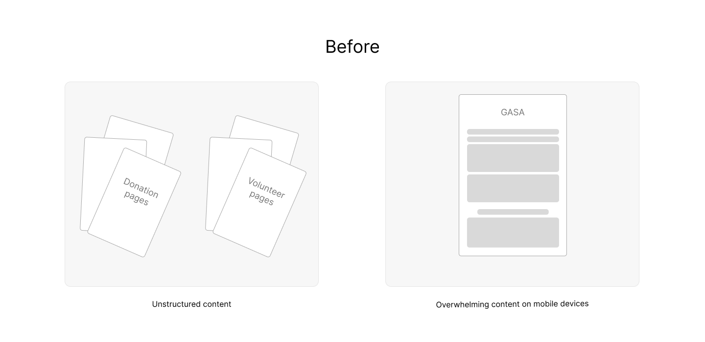
Prospective volunteers and donors struggled to understand how information was organized and what actions to take, especially on mobile devices.
- Content was overwhelming and difficult to scan on mobile.
- Information hierarchy was unclear across donation and volunteer pages.
- Expected user behavior was not clearly guided.
- High bounce rates indicated confusion rather than lack of interest.

Role + Scope
Responsibilities
- Restructured site information architecture for donation and volunteer content
- Redesigned user flows to clarify expected user actions
- Created wireframes within WordPress Avada theme constraints
- Designed visual updates that improved hierarchy and cohesion
Collaborators + Constraints
- Partnered with Donation and Volunteer Directors
- Worked with fixed language requirements for nonprofit messaging
- Maintained consistency with existing layouts and content structure
- Optimized without redesigning the site from scratch
Strategy + Approach
Rather than reinventing the site, I focused on improving clarity, hierarchy, and flow within existing constraints to support mobile users and build trust.
- Audited existing pages to identify content overload and structural gaps
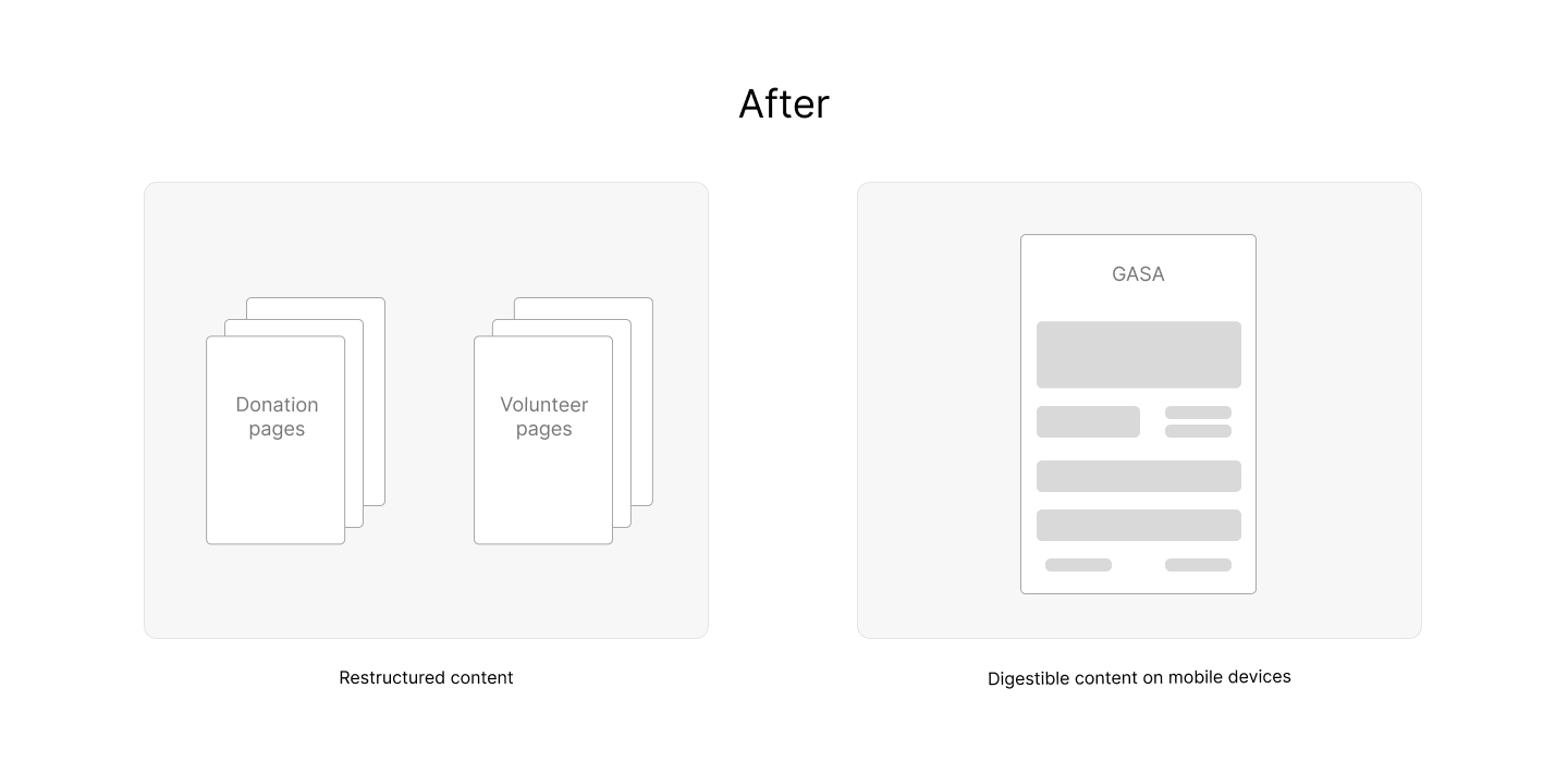
- Restructured information architecture to group related content logically
- Redesigned user flows to clarify next steps for volunteers and donors
- Created wireframes within the Avada theme to ensure feasibility
- Applied visual hierarchy to improve scannability and cohesion
Key Decisions
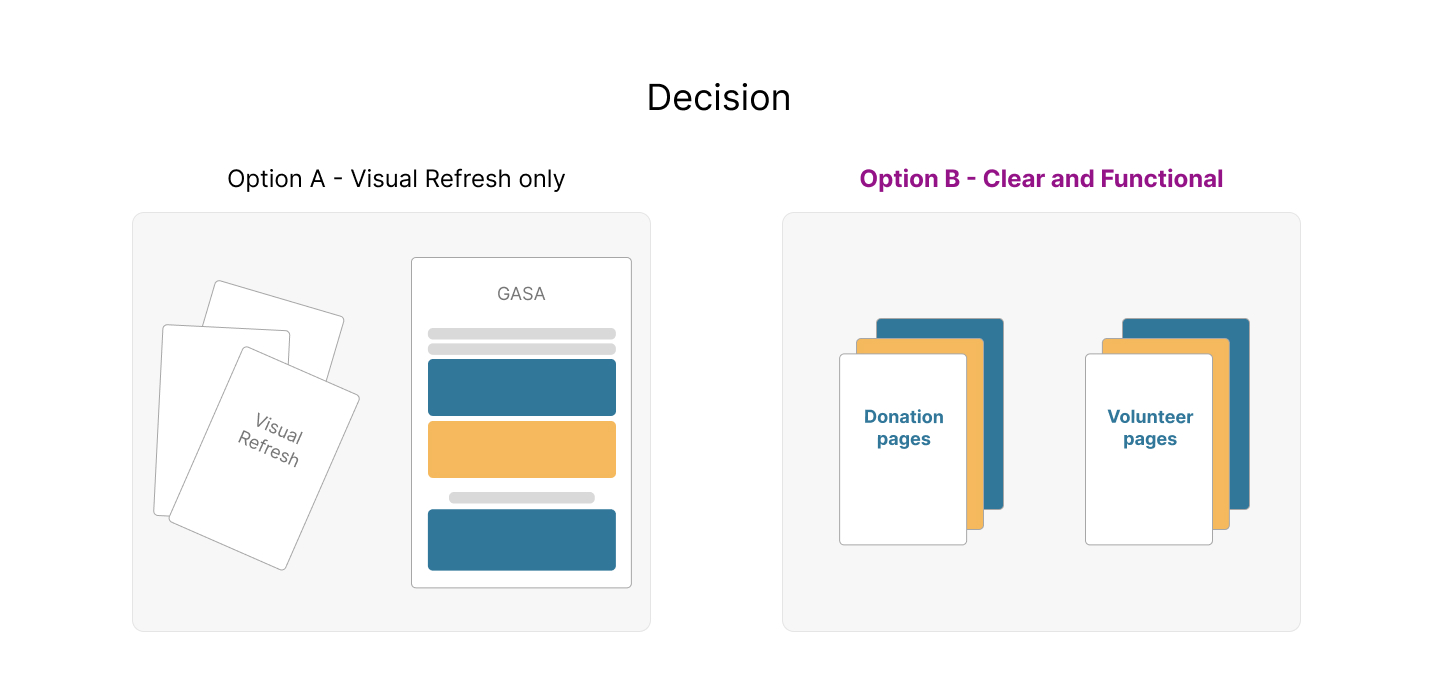
Focused on usability, hierarchy, and mobile clarity over simple visual refresh
Why it Mattered
Overwhelming content and unclear hierarchy caused high bounce rates.
Overwhelming content and unclear hierarchy caused high bounce rates.
Tradeoff
Prioritizing aesthetics over hierarchy and usability would keep users confused through flows.
Prioritizing aesthetics over hierarchy and usability would keep users confused through flows.
Outcome
Site became scannable, mobile-friendly, and guided users toward donating or volunteering.
Site became scannable, mobile-friendly, and guided users toward donating or volunteering.

Solution Overview
The optimized website introduced a clearer content structure, mobile-friendly layouts, and consistent visual hierarchy across donation and volunteer pages, making it easier for users to understand the organization’s mission and take action.

Outcomes + Impact
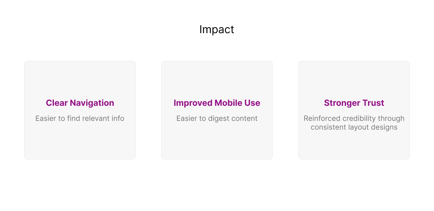
Clear hierarchy
Users could quickly understand page purpose and next steps.
Improved mobile experience
Content became easier to scan and navigate on smaller screens.
Stronger cohesion
Donation and volunteer pages felt consistent and trustworthy.

Reflection
What worked
Focusing on clarity and mobile optimization improved understanding without requiring a full redesign.
What I would improve
Validate changes with lightweight user testing to further refine content flow.
What I would do next
Track engagement metrics on key pages to identify additional opportunities for optimization.
© Samantha C. Garcia
