
Systems in Practice
Operational systems only work if the output is clear enough for people to use. These are the visual frameworks, conversion-driven designs, and scalable components behind the work, proof that systems thinking produces tangible, measurable results.
View my Case StudiesScalable Frameworks under Constraints
1. Structured Content Templates
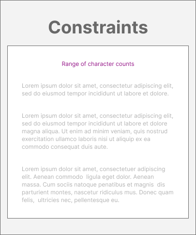
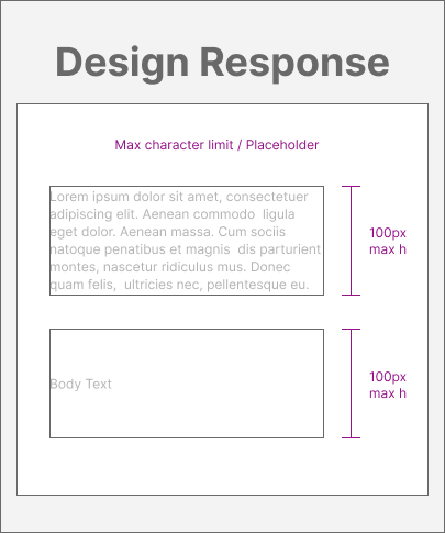
- Setting max character limits in templates solved issues between unpredictable character counts and minimum product height requirements
- Short-deadline launches were easily absorbed by standardized templates that could be applied across varying content structures
2. Scalable Documentation Framework
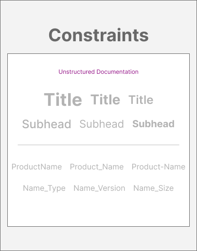
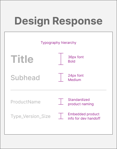
- Random heading sizes and inconsistent naming conventions were replaced with a standardized typography hierarchy and a file naming system with embedded product information
- Designs that lacked cohesive structure across team members were unified through a scalable template framework, establishing consistent standards
3. Responsive Breakpoints Integration
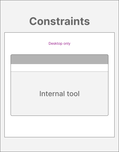
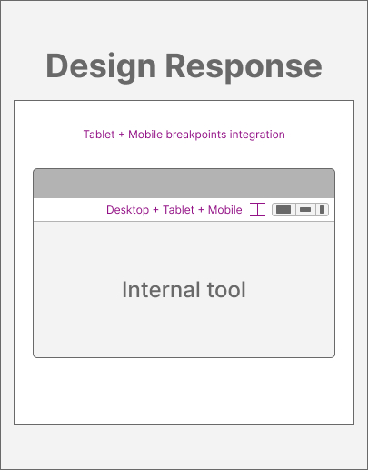
- A desktop-only design workflow with manual mobile responsiveness verification was replaced by introducing responsive breakpoints and multi-device previews directly within the internal tool
- Eliminated manual mobile testing, which removed a round of revision cycles from the production process; designers no longer cross-referenced the desktop view against a mobile phone draft to verify responsive behavior
Conversion-Driven Operational Design
Conversion Performance Optimization


- The client's ad contained no typographic hierarchy, their CTA was generic and lacked urgency, and the text-heavy layout didn't give users a visual break.
- The client's ad now contained a typographic hierarchy for the content, an image to create visual movement for the user, and more clarity for the CTA language.

Visual Systems that Scale
Product Listings Page + Product Page

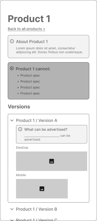
- The Listings page, designed for easy scanning, groups products by type. It contains expandable sections and tabbed navigation for free movement without losing context.
- The Product pages contain consolidated restrictions, specifications, and version differences. The embedded desktop and mobile previews reduce back-and-forth.
Case Studies
These examples highlight how I approach structure, scale, and performance. If you’d like to see the full context behind the work, explore them in detail.
© Samantha C. Garcia | 2026